UX and UI design
UX and UI Design Services That Remove the Friction Between a Ready Buyer and Your Inbox
UX and UI design services remove the things that make ready visitors hesitate at the moment they decide to contact you. We walk your inquiry path on desktop and mobile, fix unclear next steps, hidden pricing, confusing forms, and unhelpful errors, and build accessibility into every change so the website works for everyone.
- WCAG 2.2 AA in every change
- Tested on mobile and desktop
- Reply within 24 hours
Free, with no obligation
Get a free website review
Share your website, and a strategist replies within 24 hours with what to keep, what to fix, and what to rebuild.
This form needs JavaScript. Call +1 (510) 399-5523, email jd@aisearchrankings.com, or use the contact page.
Request received
Thank you. A strategist will reply within 24 hours, Monday to Friday, 9am to 6pm Pacific Time.
While you wait, you can take the free readiness check or compare the published packages.
We use your details only to reply. We never sell your information. Read our privacy policy.
Prefer to talk now? Call +1 (510) 399-5523.
Every website we build is structured so these AI search experiences can read it
 ChatGPT
 Google AI Overviews
 Google AI Mode
 Perplexity
 Microsoft Copilot
 Grok
Grok
The platform mix and monitoring coverage are confirmed for your market during onboarding.
Key takeaways
- UX and UI design work removes the things that make people hesitate at the moment they decide.
- Keyboard access, visible focus, readable contrast, labeled fields, and clear errors are included in everything we build.
- We do not promise a specific conversion percentage, because reliable testing needs traffic most businesses do not have.
- Ongoing conversion and accessibility work is included in packages from $799 per month, and larger interface projects are quoted separately.
- What happens next is unclearThe form never says who replies or when.
- Pricing is hiddenBuyers leave to find a supplier who shows it.
- Errors do not explain the fixPeople guess, then give up.
- Buttons are hard to reachSmall targets placed away from the thumb on a phone.
Each point is a common cause of abandonment, found by reviewing the whole path rather than one form.
Form friction
The last step is where ready buyers most often give up
A visitor who opens your contact form has already chosen you. Small problems there cost the most, and they are usually quick to fix.
A form that loses people
- Too many required fields before any value is offered.
- The error never says which field or how to fix it.
- Nothing explains who replies or when.
A form that gets finished
- Only the fields needed to reply are required.
- Errors name the field and the fix, and entries are kept.
- The button and the reply promise tell people what happens next.
Planning a new website?
Tell us about your project, and a strategist replies within 24 hours with how we would scope it.
Accessibility review
Built for everyone, checked against a published standard
We review against the Web Content Accessibility Guidelines (WCAG) 2.2 at level AA, so every finding points to a criterion you can look up.
| Check | Result | Where | Fix |
|---|---|---|---|
| Text contrast of at least 4.5 to 1 | Fail | Gray footer links | Darken the link color |
| Every form field has a label | Partial | Phone field uses a placeholder only | Add a visible label |
| Keyboard focus is visible | Pass | All pages | Keep as is |
See what this looks like for your business
We review your current website for free and point out what to keep, what to fix, and what to rebuild.
How the review works
We walk the whole path, not just one form
Friction often starts pages before the form, so the review follows a buyer from the first page they land on to the confirmation message.
- Walk the pathFrom landing page to confirmation, on mobile and desktop.
- Rank the frictionProblems closest to the inquiry come first.
- Design the fixWording, layout, and states, approved by you.
- Build and testChecked with a keyboard, a screen reader, and a phone.
- Measure inquiriesInquiries compared before and after each change.
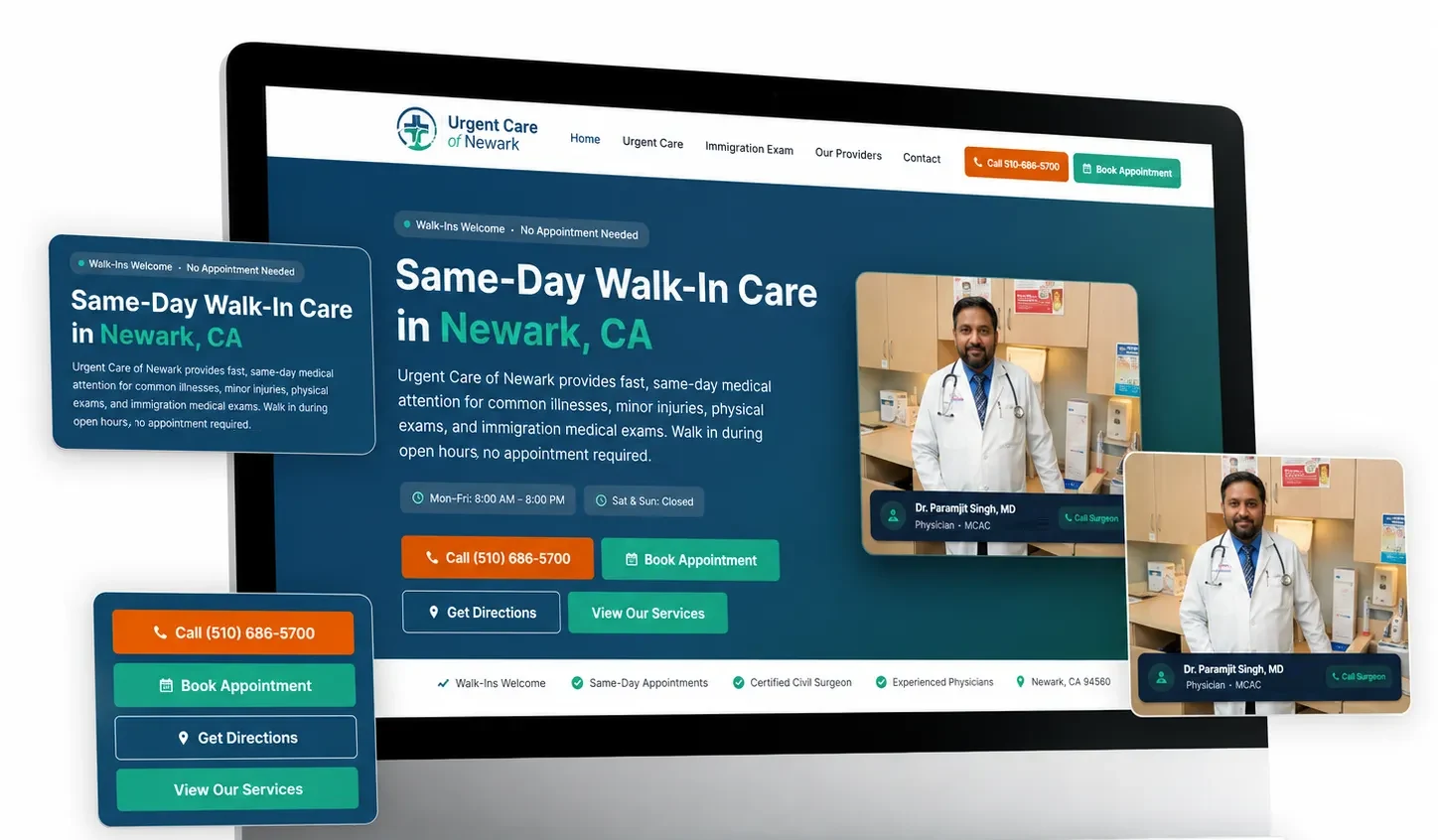
Screenshot from a documented healthcare project with call and booking actions on mobile. Select it to open the project.
Planning a full rebuild? Read about website design services or website redesign services.
Want a fixed price before you commit?
Get a written scope with the pages, features, and schedule set out before any work starts.
Free self check, about 2 minutes
Conversion friction check
Answer eight questions about the moment a visitor decides to contact you. Each no is a place where ready buyers leave.
Your result
Your fixes, in priority order
Every item is in place. Keep checking these each quarter, because vendors change their crawlers and your website changes over time.
Your answers are used only to show your score. With JavaScript on, they stay in this browser tab and are sent only if you include them in the request form.
Proof with its limits attached
Documented results, labeled honestly
Each result states what was measured, where the data came from, and what it does not prove. Past results show what the approach can do. They do not guarantee your outcome.
-
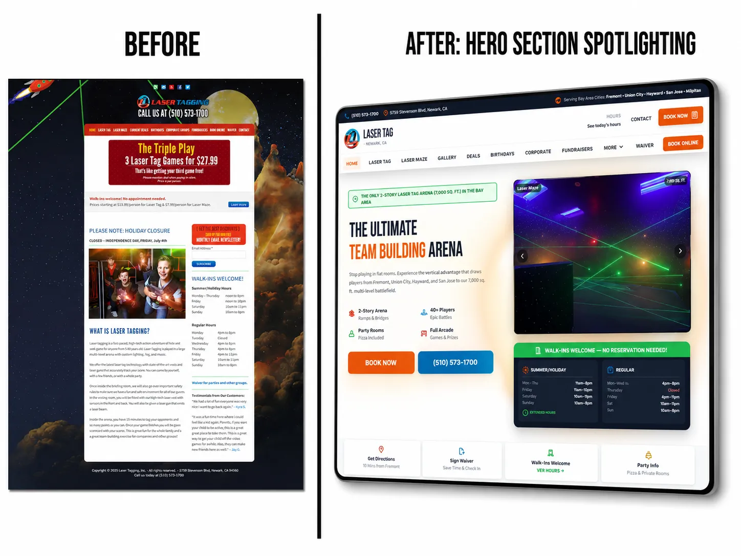

Measured on Google AI Overviews and AI Mode
Client-reported private Google Search Console result
4,460Google generative AI impressions
Laser Tagging Inc. Google AI Overviews and AI Mode
AI Search Rankings rebuilt the Laser Tagging Inc. digital brand and website, expanded its service-area relevance across Newark, Fremont, San Jose, and nearby Bay Area communities, and documented 4,460 client-reported Google generative AI impressions in the selected last-three-month window.
Limitation. The report measures Google generative AI impressions. It does not prove a ChatGPT recommendation, a click, a booking, a lead, or revenue.
Newer data shared by the client: a Google Search performance export for search type Web shows 6,109 impressions in the last 3 months as of September 13, 2026, compared with 947 in the previous 3 months. That total covers all Google web results, not only AI features. Checked September 13, 2026. Open the search performance export shared by Laser Tagging Inc. (opens in a new tab)
Read the Laser Tagging Inc. case studyView the Laser Tagging Inc. project
-
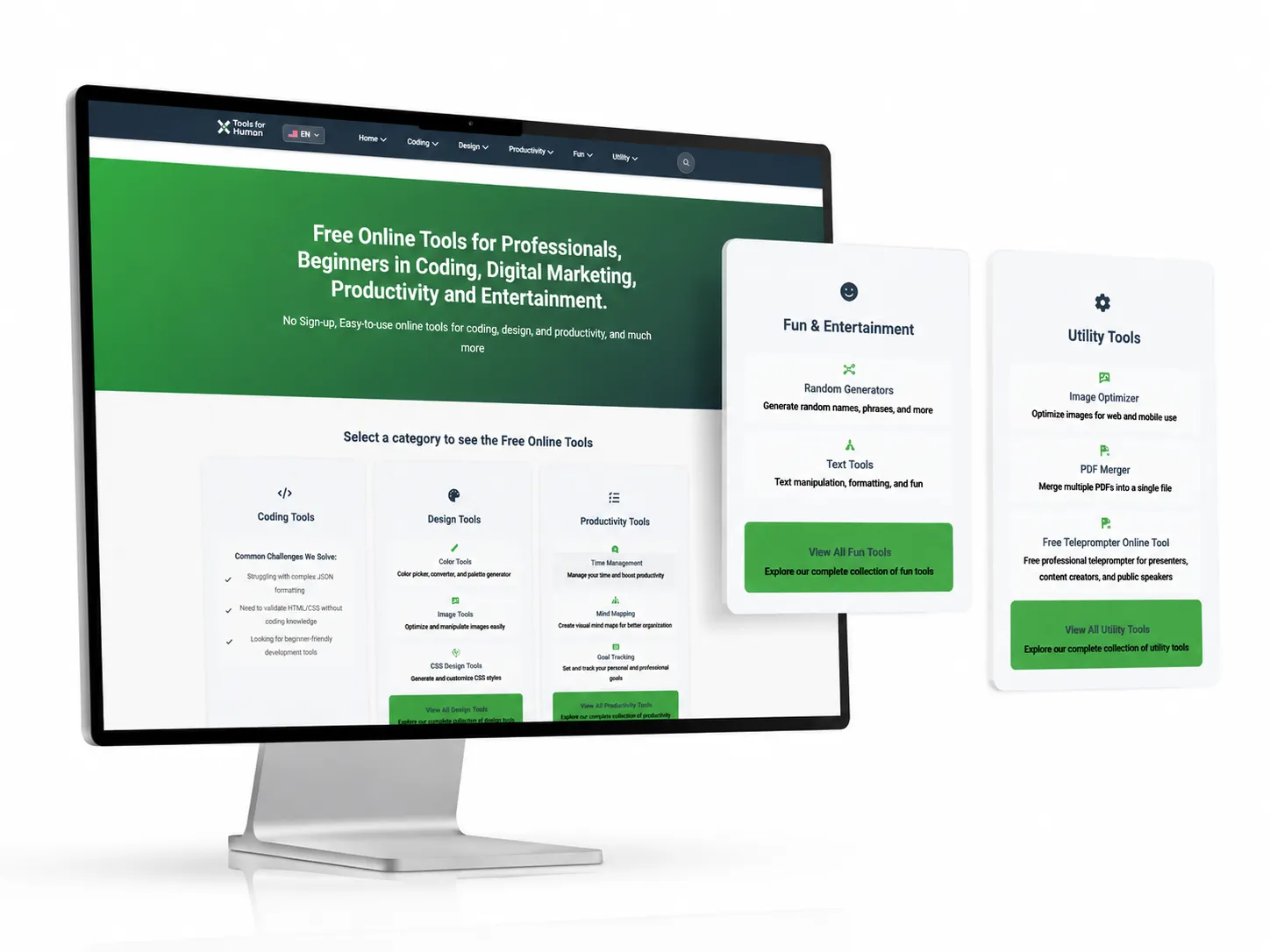

Measured on Microsoft Copilot
Verified result
26,300Microsoft Copilot citations
Toolsforhuman.com Microsoft Copilot
AI Search Rankings used schema-first Answer Engine Optimization, layered JSON-LD, robust canonicals, and multilingual hreflang to help Toolsforhuman.com earn 26,300 Microsoft Copilot citations across 160 plus pages, including Spanish-language pages, in a sample window of about three months.
Limitation. The result applies to the documented sample window and does not guarantee future citations.
8 documented portfolio projects you can inspect
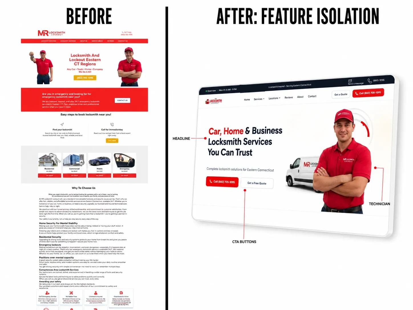
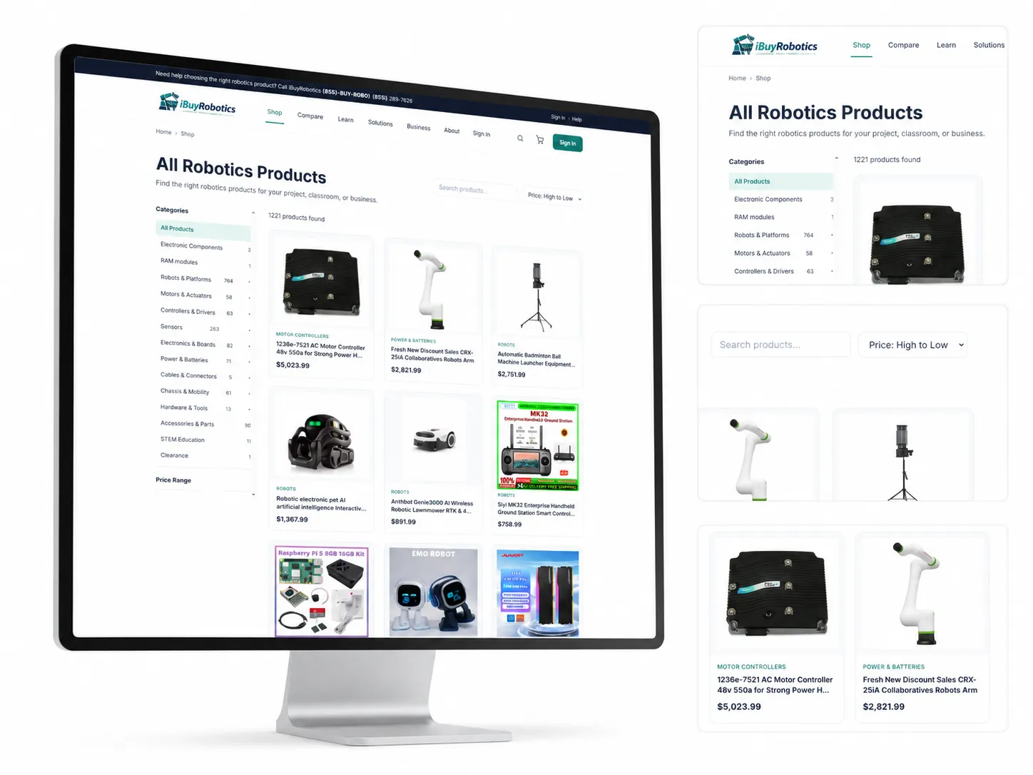
Screenshots from documented client projects. Select a screenshot to open the project.
How AI Search Rankings labels and measures results
See what we would change on your website
Share your website, and we will point out what to keep, what to fix, and what to rebuild, free and with no obligation.
Why AI Search Rankings
Why businesses choose us for UX and UI Design
Senior expertise, published prices, and honest reporting from the first conversation. This is what partnering with us looks like.
Led by a named expert
Jagdeep Singh, Founder and Lead Answer Engine Optimization Strategist, brings 12+ years of SEO and digital marketing experience and 9 Google Skills certifications you can verify.
Fixed scopes and published prices
Builds are quoted as a fixed, written scope, and the ongoing program is published at $799, $1,500, and $3,500 per month.
Built for search and AI from day one
Every build ships with clean HTML, structured data that matches the page, and redirects planned before launch.
Proof with its limits stated
Results such as 26,300 Microsoft Copilot citations for Toolsforhuman.com are published with how they were measured and what they do not prove.
Honest about what no one controls
We guarantee the work, not rankings or citations, so you are never sold a promise that cannot be kept.
A fast, straight answer
A strategist replies within 24 hours, Monday to Friday, and tells you plainly when we are not the right fit.
Ready for a website that brings in work?
Get a fixed, written scope before any work starts, with no obligation.
Published pricing
What UX and UI Design costs, and which scope fits you
Every price is a fixed monthly scope of work. It is never a promise about rankings or AI citations, because other companies control those systems.
New website or redesign
Build work is quoted per project as a fixed, written scope before any work starts. A single published figure would mislead you, because the cost depends on page count, features, integrations, and content volume.
You own your domain, hosting account, content, and code when the project is finished. The ongoing monthly program is a separate decision, and you are never required to buy it.
Request a fixed project quote- The scope, schedule, and approval points are written down before work begins.
- Redirects, structured data, and speed are part of the launch checklist, not extras.
- Rankings and indexing are watched through launch.
- You approve the design and the content before anything goes live.
Ongoing monthly program
After launch, the ongoing program keeps pages improving, content growing, and questions tracked. These are the same three published packages.
-
Local small businesses
Local AI Answer Starter
$799 per month
Help nearby customers find, trust, and choose your business across Google, Google Maps, and AI answers.
- Local buyer prompts tracked
- 25
- Local competitors compared
- 3
- Page optimized monthly
- 1
- New local answers monthly
- 3 to 5
-
Growing local businesses
Local AI Answer Growth
$1,500 per month
Win more calls, bookings, and quote requests across Google, Google Maps, and AI answer engines.
- Local buyer prompts tracked
- 50 to 75
- Local competitors compared
- 5
- Pages optimized monthly
- 2 to 3
- New local answers monthly
- 5 to 10
-
Competitive & multi-location businesses
Local AI Answer Authority
$3,500 per month
Build a complete local authority system across Google, Maps, AI answers, reviews, and content.
- Local buyer prompts tracked
- 150 to 250
- Local competitors compared
- 10
- Pages optimized monthly
- 5 to 8
- New local answers monthly
- 10 to 20
Straight answers
UX and UI design questions, answered
Plain answers to the questions buyers ask most. If yours is not here, ask a strategist directly.
What do UX and UI design services include?
UX and UI design services review the path a visitor takes from arriving on your website to contacting you, then redesign the pages, forms, buttons, and messages that cause hesitation. Accessibility is built into every change, so the website works for keyboard and screen reader users too.
What is the difference between UX and UI?
UX, or user experience, is how easy it is to get something done, such as finding a price or sending an inquiry. UI, or user interface, is what people see and touch, such as buttons, forms, and layout. Good UI supports good UX, and both are reviewed together.
Why do visitors leave without contacting us?
Common reasons are unclear next steps, hidden pricing, forms that ask for too much, error messages that do not explain the fix, and buttons that are hard to reach on a phone. The review finds which of these apply to your website.
Can you promise a specific increase in conversions?
No. Reliable testing needs more traffic than most businesses have, and results depend on your offer and market. We fix clear, well documented causes of friction and measure inquiries before and after each change.
Which accessibility standard do you follow?
We design to the Web Content Accessibility Guidelines (WCAG) 2.2 at level AA, which includes text contrast of at least 4.5 to 1 for normal text, keyboard access, visible focus, labeled form fields, and clear error identification.
Does accessibility help search and AI tools?
Many accessibility practices, such as real headings, labeled fields, and text alternatives for images, also make a page easier for machines to read. The main reason to do it is that more people can use your website.
How much do UX and UI design services cost?
Ongoing conversion and accessibility work is included in packages from $799 per month. Larger interface projects, such as a redesigned booking flow, are quoted separately as a fixed, written scope.
Do you test on phones?
Yes. Every change is checked on mobile and desktop, including tap target size, text size, and whether the main action stays within easy reach of the thumb.
Free, with no obligation
Find where ready buyers leave your site
Choose what you need help with and tell us where to reply. We walk your inquiry path on desktop and mobile and respond within 24 hours.
What happens after you send it
- We review your website and the answers AI tools give for your buyer questions.
- A strategist replies within 24 hours, Monday to Friday, 9am to 6pm Pacific Time.
- You get a clear recommendation, including when we are not the right fit.
Prefer to talk now?
This request form needs JavaScript. You can still reach a strategist by phone, text, or email using the links beside this form, or use the contact page.
Request received
Thank you. A strategist will reply within 24 hours, Monday to Friday, 9am to 6pm Pacific Time. A confirmation email is on its way.
While you wait, you can run the free AI visibility audit or compare the published packages.
We use your details only to reply to this request. There is no obligation, and we never sell your information. Read our privacy policy.